Case Study
Constellation Energy
Creative direction across a multi-year evolution of Constellation Energy’s digital marketing—connecting brand strategy, audience insight, performance and emerging AI tools to build campaigns designed to work across markets and media.
Role: Associate Creative Director / Design Director
Focus: Creative Direction · Campaign Strategy · Art Direction · Paid Media · Video · AI-Enhanced Production · Creative Systems
Channels: Meta · YouTube · CTV · Display · Landing Pages · Digital Campaigns
01 The Challenge
Creating distinction in a low-interest category.
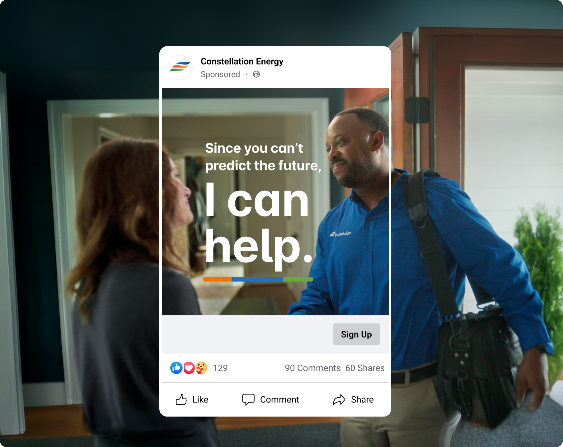
Electricity is invisible, competitors often communicate similar benefits, and customers rarely think about switching providers until they have a reason to. The challenge was to make Constellation more distinctive and relevant by turning ideas like predictability, transparency and trust into clear, human creative.
02 The evolution
Building a stronger creative language over time.
Across three years, the work evolved from individual digital campaigns into a broader creative system spanning paid media, organic social and video. I helped guide that evolution through stronger art direction, more conceptual storytelling and a clearer connection between brand strategy and performance creative.
03 The strategy
Different audiences need different conversations.
We established clearer roles for creative across the customer journey—from creating curiosity among audiences not considering a switch, to communicating value for active shoppers and driving action at conversion. This gave each campaign a more focused strategic purpose while keeping the brand experience connected.

04 The creative
Turning abstract benefits into ideas people can feel.
Because electricity itself offers little visual storytelling, we translated benefits such as predictability, transparency and trust into relatable situations, visual metaphors and moments of humour. This created flexible campaign territories that could feel human and distinctive without relying on traditional utility advertising.
05 The system
One idea, designed to travel.
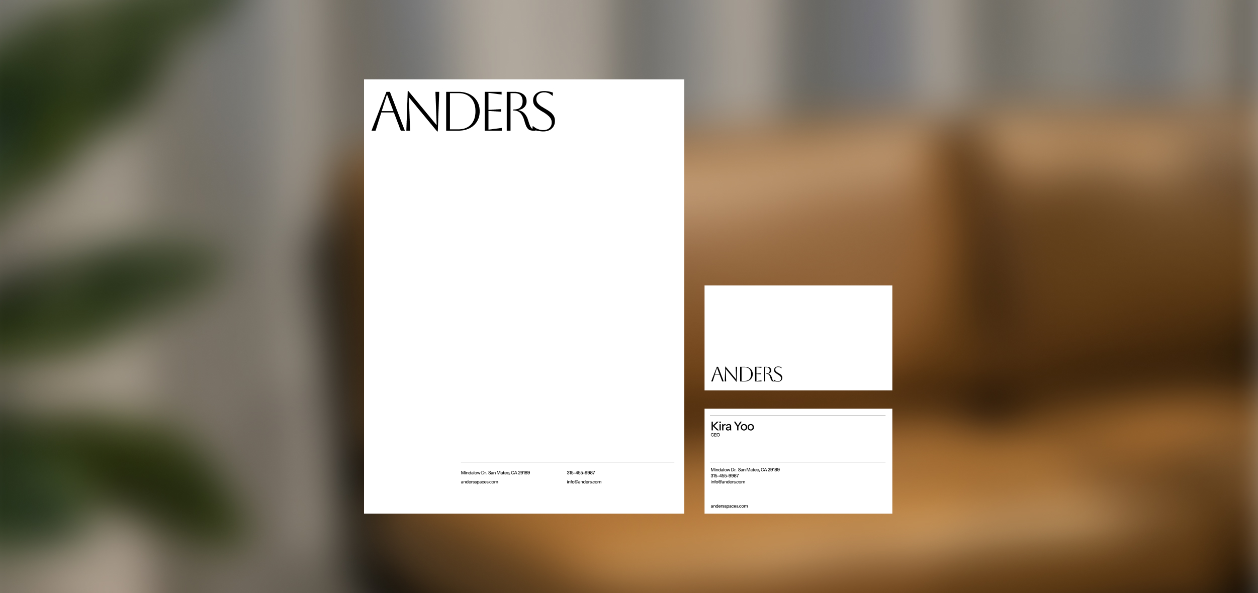
Campaign concepts were developed to work across Meta, display, CTV and YouTube—not simply resized from a master execution. Each idea adapted to the behaviour of the channel, from immediate static communication to 30-, 15- and 6-second stories, while maintaining a recognizable creative thread.
05 AI enhanced creative
Expanding the possibilities of production.
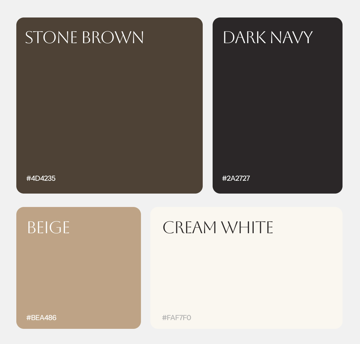
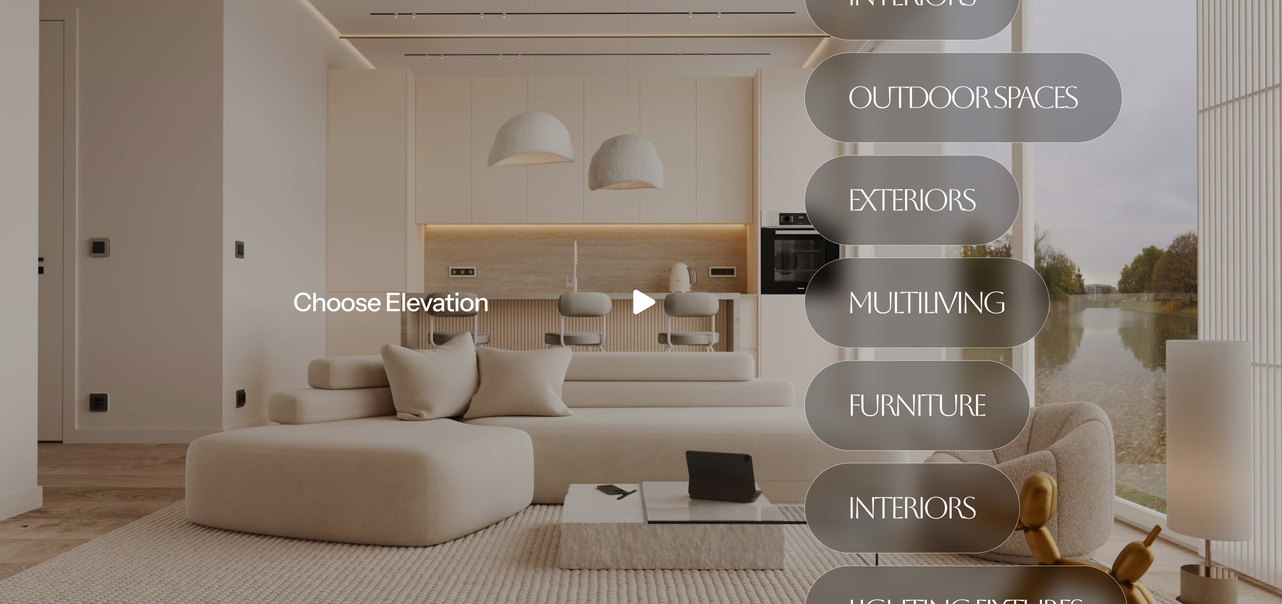
I introduced generative AI into ideation and production to explore visual territories, prototype concepts and create or enhance imagery that would otherwise be difficult to produce. AI became another tool within the creative process—combined with design, photography, motion and deliberate art direction rather than replacing them.
→
Previous: Name of project
Next: Name of project
→

Connect with us to explore your project's potential.


OFFICE
15 Candyland Lane 28010 San Francisco
CONTACT
(646) 555-4567
hello@figma.com
SOCIAL
Behance
Spotify


Case Study
Constellation Energy
Creative direction across a multi-year evolution of Constellation Energy’s digital marketing—connecting brand strategy, audience insight, performance and emerging AI tools to build campaigns designed to work across markets and media.
Role: Associate Creative Director / Design Director
Focus: Creative Direction · Campaign Strategy · Art Direction · Paid Media · Video · AI-Enhanced Production · Creative Systems
Channels: Meta · YouTube · CTV · Display · Landing Pages · Digital Campaigns
01 The Challenge
Creating distinction in a low-interest category.
Electricity is invisible, competitors often communicate similar benefits, and customers rarely think about switching providers until they have a reason to. The challenge was to make Constellation more distinctive and relevant by turning ideas like predictability, transparency and trust into clear, human creative.
02 The evolution
Building a stronger creative language over time.
Across three years, the work evolved from individual digital campaigns into a broader creative system spanning paid media, organic social and video. I helped guide that evolution through stronger art direction, more conceptual storytelling and a clearer connection between brand strategy and performance creative.
03 The strategy
Different audiences need different conversations.
We established clearer roles for creative across the customer journey—from creating curiosity among audiences not considering a switch, to communicating value for active shoppers and driving action at conversion. This gave each campaign a more focused strategic purpose while keeping the brand experience connected.
04 The creative
Turning abstract benefits into ideas people can feel.
Because electricity itself offers little visual storytelling, we translated benefits such as predictability, transparency and trust into relatable situations, visual metaphors and moments of humour. This created flexible campaign territories that could feel human and distinctive without relying on traditional utility advertising.
05 The system
One idea, designed to travel.
Campaign concepts were developed to work across Meta, display, CTV and YouTube—not simply resized from a master execution. Each idea adapted to the behaviour of the channel, from immediate static communication to 30-, 15- and 6-second stories, while maintaining a recognizable creative thread.
05 AI enhanced creative
Expanding the possibilities of production.
I introduced generative AI into ideation and production to explore visual territories, prototype concepts and create or enhance imagery that would otherwise be difficult to produce. AI became another tool within the creative process—combined with design, photography, motion and deliberate art direction rather than replacing them.
→
Previous: Name of project
Next: Name of project
→

Connect with us to explore your project's potential.

OFFICE
15 Candyland Lane 28010 San Francisco
CONTACT
(646) 555-4567
hello@figma.com
SOCIAL

Case Study
Constellation Energy
Creative direction across a multi-year evolution of Constellation Energy’s digital marketing—connecting brand strategy, audience insight, performance and emerging AI tools to build campaigns designed to work across markets and media.
Role: Associate Creative Director / Design Director
Focus: Creative Direction · Campaign Strategy · Art Direction · Paid Media · Video · AI-Enhanced Production · Creative Systems
Channels: Meta · YouTube · CTV · Display · Landing Pages · Digital Campaigns
01 The Challenge
Creating distinction in a low-interest category.
Electricity is invisible, competitors often communicate similar benefits, and customers rarely think about switching providers until they have a reason to. The challenge was to make Constellation more distinctive and relevant by turning ideas like predictability, transparency and trust into clear, human creative.
02 The evolution
Building a stronger creative language over time.
Across three years, the work evolved from individual digital campaigns into a broader creative system spanning paid media, organic social and video. I helped guide that evolution through stronger art direction, more conceptual storytelling and a clearer connection between brand strategy and performance creative.
03 The strategy
Different audiences need different conversations.
We established clearer roles for creative across the customer journey—from creating curiosity among audiences not considering a switch, to communicating value for active shoppers and driving action at conversion. This gave each campaign a more focused strategic purpose while keeping the brand experience connected.
04 The creative
Turning abstract benefits into ideas people can feel.
Because electricity itself offers little visual storytelling, we translated benefits such as predictability, transparency and trust into relatable situations, visual metaphors and moments of humour. This created flexible campaign territories that could feel human and distinctive without relying on traditional utility advertising.
05 The system
One idea, designed to travel.
Campaign concepts were developed to work across Meta, display, CTV and YouTube—not simply resized from a master execution. Each idea adapted to the behaviour of the channel, from immediate static communication to 30-, 15- and 6-second stories, while maintaining a recognizable creative thread.
05 AI enhanced creative
Expanding the possibilities of production.
I introduced generative AI into ideation and production to explore visual territories, prototype concepts and create or enhance imagery that would otherwise be difficult to produce. AI became another tool within the creative process—combined with design, photography, motion and deliberate art direction rather than replacing them.
→
Previous: Name of project
Next: Name of project
→

Connect with us to explore your project's potential.

OFFICE
15 Candyland Lane 28010 San Francisco
CONTACT
hello@figma.com
SOCIAL
